Kinetic typography animation turns words into the visual story: pacing, scale, color, and motion replace illustration. It is one of the most attention-grabbing formats in modern motion graphics, used for manifestos, quotes, statistics, and punchy brand copy. This post covers when to use kinetic typography, what makes it work, and how to brief a piece. See our best motion graphics styles and design in motion guides.
Why Kinetic Typography Matters for Modern Brands
The power of kinetic typography animation lies in its ability to fuse visual rhythm with verbal content. When text moves, it invites the viewer’s eye to follow a narrative path rather than passively read. This subtle shift from reading to watching unlocks higher retention rates and emotional resonance.
Consider how headlines on social media scroll past our screens every second. A static headline can be ignored in an instant; a moving headline, however, commands attention for longer. For brands that need to stand out, whether they’re launching a new product or explaining complex data, kinetic typography provides the extra edge.
In practice, kinetic typography can:
- Highlight key messaging points
- Guide viewers through complex narratives
- Create memorable brand moments that linger in the mind
Case Studies That Illustrate Impact
View case studies from our work at our Projects page.

Crafting the Perfect Kinetic Typography Sequence
Creating an effective kinetic typography animation requires a disciplined approach that balances design, timing, and storytelling. Below are the essential steps we follow to ensure every project delivers maximum impact.
1. Define the Core Message
The first step is always clarity: what single idea or emotion should dominate the viewer’s mind? A well-defined core message informs font choice, color palette, and motion style.
2. Choose Typography That Speaks
Not all typefaces are created equal when it comes to animation. Sans-serif fonts with clean lines often perform best because they remain legible even at high speeds. However, a bold serif can add gravitas if the message demands authority.
3. Map the Motion Path
The movement of each letter or word should feel intentional. A common technique is to use linear motion with easing curves, which gives text a natural acceleration and deceleration, mirroring how we read in real life.

4. Sync With Audio and Sound Design
Even when words are the primary focus, subtle sound effects or background music can amplify the emotional tone. A gentle click on each letter arrival or a swoosh during transitions creates an immersive experience.
Real-World Applications Across Industries
Kinetic typography is versatile enough to be applied across sectors, from tech startups needing to explain complex algorithms to hospitality brands wanting to showcase service stories. Its adaptability makes it an invaluable asset in any visual communication toolkit.
Tech and Finance: Simplifying Complexity
Financial dashboards or AI product launches often involve dense information that can overwhelm audiences. By animating key metrics, companies can guide viewers through data points effortlessly, turning numbers into a narrative arc.
Healthcare and Pharma: Humanizing Science
When explaining medical breakthroughs or pharmaceutical processes, kinetic typography can break down jargon into digestible chunks, fostering trust and understanding among patients and stakeholders alike.
Hospitality and Tourism: Evoking Emotion
Brands in the hospitality sector use kinetic typography to evoke feelings of wanderlust. By animating evocative words, “escape,” “discover,” “relax”, they create an immediate emotional connection with potential guests.
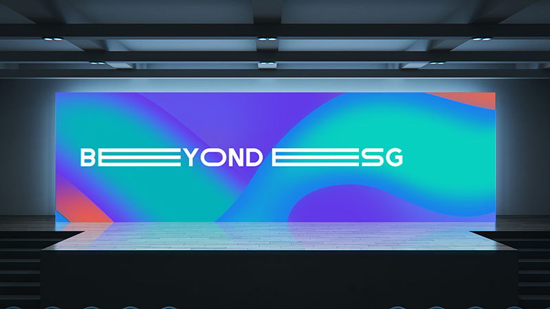
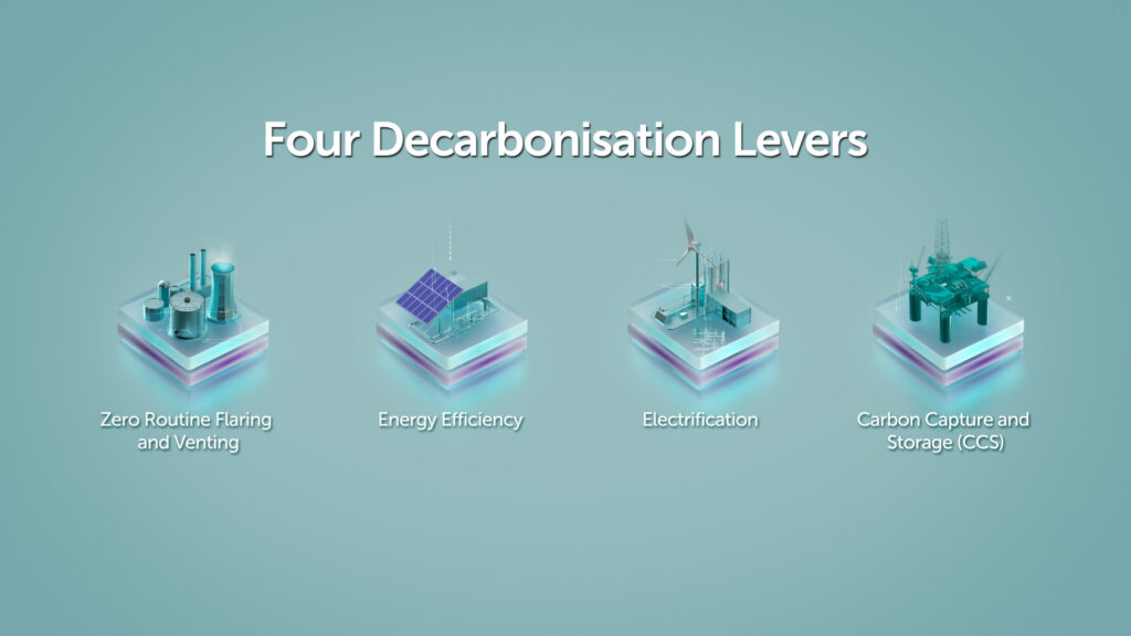
Oil & Gas and Renewables: Communicating Sustainability
These industries face the challenge of translating technical operations into accessible narratives. Kinetic typography helps simplify complex processes, making sustainability stories more relatable to a broader audience.
How We Translate App Features Into Visual Narratives
Want to see how we translate app features into visual narratives? Visit our 2D Explainer for Hilton Hotels.
Discover How We Crafted an Effective 2D Explainer
Discover how we crafted an effective 2-D explainer in our animation for McDonalds.
Need a Quick Example of Collage Animation?
Need a quick example of how we use collage animation to explain historical stories? Browse our collage-style stopmotion inspired animation for Ministry of Home Affairs.
If you’re planning a new motion animation, check out our animation for Atelier Wen’s watches.
Collage-Style Stop Motion: A Historical Narrative
This project combined archival images, handwritten notes, and kinetic typography to bring a historical timeline to life. The moving text served as a bridge between static visuals, guiding viewers through the narrative flow.
Summary
Kinetic typography animation transforms ordinary words into powerful storytelling tools that captivate audiences across industries. By carefully selecting typefaces, motion paths, and audio cues, brands can turn even the simplest message into an engaging visual experience.
Whether you’re looking to explain a complex algorithm, showcase a new app feature, or evoke emotions in a hospitality setting, kinetic typography offers a versatile solution that delivers results.
CRITICA is a creative production studio in Singapore. We take brands from research and concept through storyboard to final delivery, producing motion graphics, video, and experiential work for Finance, Healthcare, Technology, Hospitality, Tourism, Oil & Gas, and Renewables. Contact us to discuss a project you have in mind.
FAQ
What is kinetic typography animation?
Kinetic typography is animated text where the words themselves carry the visual story: pacing, scale, color, and motion replace traditional illustration. It is one of the most attention-grabbing formats in modern motion graphics.
When should I choose kinetic typography over illustration?
When the message is the message: quotes, manifestos, statistics, lyrics, or punchy brand copy. Skip it when the story needs characters, real-world setting, or product detail.
Does kinetic typography work for B2B?
Yes. It works particularly well for thought leadership, founder messages, manifesto videos, and stat-led brand posts. The format reads as confident and direct.
How long should a kinetic typography piece be?
15 to 30 seconds for social, 45 to 90 seconds for a brand statement, longer for keynote-style content. The format gets fatiguing past 90 seconds without visual variety.
What software powers kinetic typography?
Adobe After Effects is the industry standard. Cinema 4D and Blender handle 3D type. Strong design fundamentals matter more than the tool: spacing, hierarchy, and rhythm carry the work.


