




Interactive Installation Design for Screens, Spaces and Events

Walk into a well-designed conference hall before a single word is spoken, and the room already tells you where you are. A wide LED wall breathes slow colour behind the stage. Light moves across the floor screens. The brand is everywhere and nowhere, felt rather than read. That feeling is not an accident. It is interactive installation design at work, shaping the space before the content even starts.

Most brands still treat screens as places to play a finished video. We see them differently. When event visuals are designed for the room, the surfaces, and the way people move through a space, the screen stops being a TV on a wall and becomes part of the architecture. This article looks at how that shift happens, why it matters for events and branded spaces, and what separates a coherent visual environment from a wall of mismatched clips.

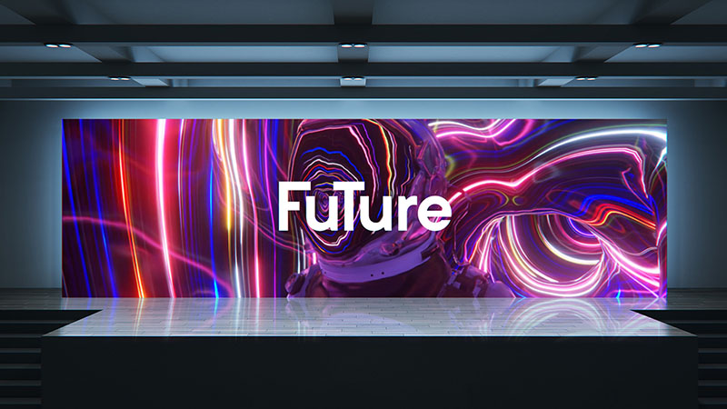
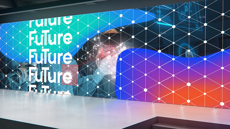
Vibrant neon lights swirl behind bold "FUTURE" text on a sleek, modern display

You will see how we approach LED wall content as a designed environment rather than a single deliverable, the three modes event and experiential work falls into, the technical groundwork that keeps it sharp, how a project like this actually runs, and where these projects most often go wrong.

What Event Motion Graphics Actually Means

Environmental design treats a physical space as a single composition. Motion graphics for LED displays sit inside that composition as living surfaces, not decoration bolted on at the end. The goal is a space that reads as one designed world across every screen, wall, and corner a person can see.

There is a simple test for this. Stand in the middle of the room and turn slowly. If the stage screen, the side panels, the entrance signage, and the floor screens all feel like they belong to the same idea, the environment is working. If each surface looks like it came from a different brief, you have a collection of screens, not an environment.

This is where design discipline matters more than raw spectacle. A coherent environment uses one visual language. Typography behaves the same way on the entrance wall as it does behind the keynote speaker. Colour transitions are timed so that nothing fights for attention at the wrong moment. The motion has a rhythm that matches the pace of the event, calm during arrival, sharper during reveals.

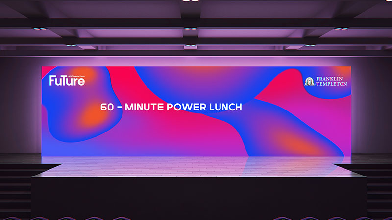
We build this thinking into projects like the Future by Franklin Templeton conference motion graphics, where a large set of event assets had to hold together as one system across a fintech conference. Individually each asset is a small piece of animation. Together they had to feel like one designed event rather than a folder of unrelated files.

The distinction matters commercially, not just aesthetically. A room that reads as one world signals a brand that has its act together. A room of mismatched screens signals the opposite, and audiences register it long before they could explain why.

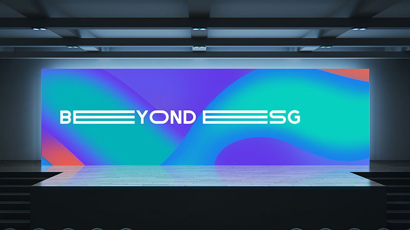
Modern stage with vibrant gradient backdrop displaying "BEYOND SG" logo

Why Screens Become Part of the Architecture

A screen used well changes how a space feels to stand in. That is the difference between playing a video and designing an environment. When the motion is built for the room, it guides attention, sets mood, and gives people a sense of scale they cannot get from a static set.

Consider the arrival moment at an event. Before any presentation begins, attendees walk in, find seats, and form a first impression. An event opening sequence designed for the main LED wall sets the emotional temperature for everything that follows. Our work on the Switch event opening and the Ultherapy event opening both started from this idea, that the first thirty seconds on screen decide whether a room leans in or stays on their phones.

Scale is the other reason screens read as architecture. A piece of motion design that looks fine on a laptop can feel thin across a twelve-metre wall. Content built for environmental use accounts for the physical size, the viewing distance, and the fact that people see it from many angles at once. The composition has to hold up close and far away.

This is also true outside events. In permanent branded spaces, lobbies, retail walls, and experience centres, the screen becomes a fixed part of the interior. Our Marina Bay Sands visual work treated the display as a designed feature of the space, something the architecture was built around rather than an afterthought hung on a wall.

There is a useful way to think about the difference. A video has a start and an end and expects your full attention for its duration. An environment has neither. People arrive in the middle of it, glance at it, walk past it, come back to it. Content that assumes a captive viewer fails in a space where nobody is captive.

The Three Modes of Experiential Screen Content

Experiential motion graphics are not one discipline. Across the projects we take on, the work falls into three modes, and knowing which one you are commissioning changes almost every decision that follows.

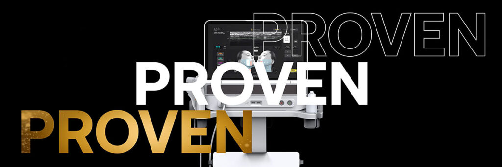
Medical device with "PROVEN" text overlay in white, gold, and outlined styles

Linear Content

Linear content plays start to finish on a schedule someone controls. Event openings, stage backdrops, award reveals, and sponsor reels all sit here. The audience is seated and attentive, and the content has a known duration and a known moment.

This is the most common mode and the most understood. It is also where craft shows most plainly, because everyone in the room is looking at the same thing at the same time. There is nowhere to hide a weak transition or a typeface that does not survive being three metres tall.

Ambient and Responsive Content

Ambient content runs continuously with no fixed beginning. Lobby walls, retail displays, corridor installations, and holding screens all live in this mode. Nobody watches from the start because there is no start.

Responsive content is ambient content that reacts. It might respond to people moving past, to the time of day, or to a live data feed. The design problem changes completely, because you are no longer choreographing a viewing experience. You are designing a system of behaviours that has to look considered in every state it can land in.

Pink trees reflect in turquoise water under surreal, flowing sky

Immersive and Virtual Environments

The third mode surrounds the viewer or replaces the room entirely. Wraparound screens, forced perspective installations, and fully virtual spaces built in engines like Unreal, along with branded worlds on platforms like Roblox, all belong here.

What unites them is that the viewer is inside the composition rather than in front of it. Perspective, depth, and the viewer’s actual physical position become design inputs rather than afterthoughts.

Most substantial projects mix modes. A conference might open with linear content, hold ambient content between sessions, and place a responsive installation in the foyer. Problems usually start when a client briefs one mode and expects the behaviour of another.

Interactive Installation Design in Practice

Responsive work is where interactive installation design stops being decoration and starts being a system. It is also the mode most often briefed badly, because the word “interactive” gets used for everything from a touchscreen kiosk to an installation that quietly reads a room.

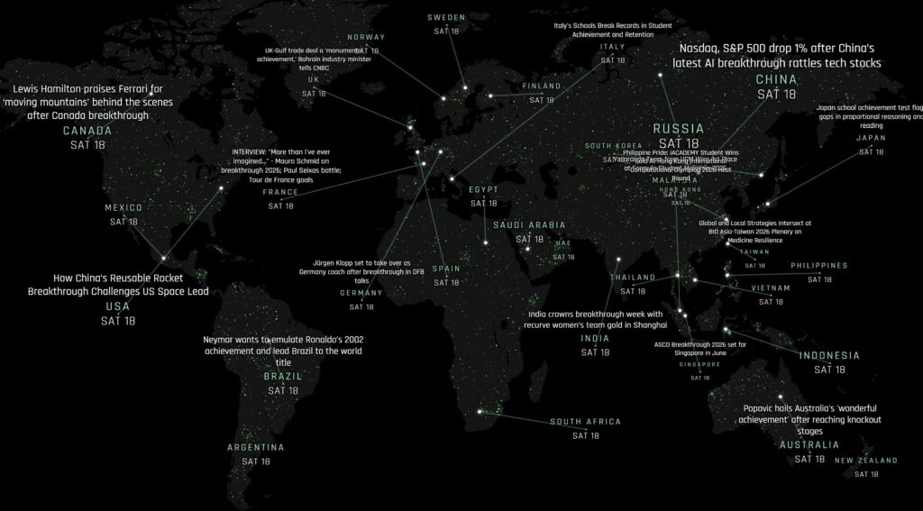
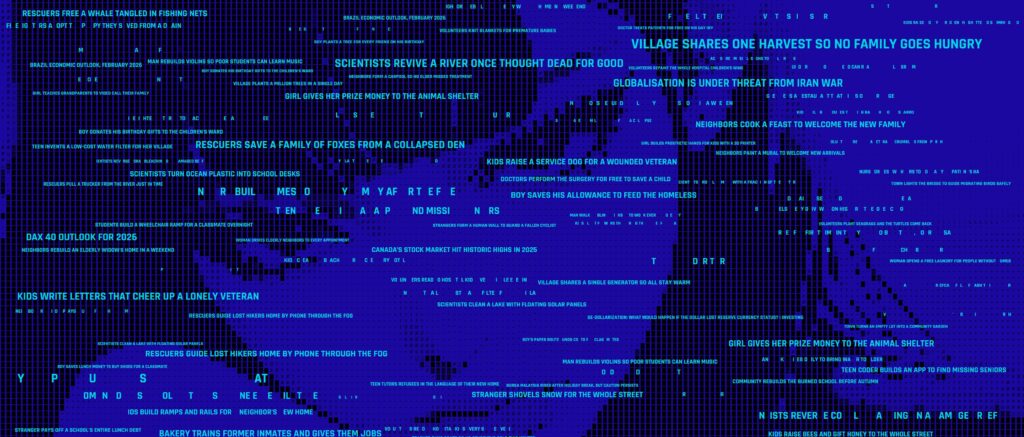
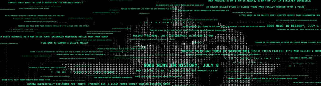
Our WorldMonitor installation is a useful illustration. A financial institution asked us to turn the main corridor of their office into something more than a walkway. The result runs the full length of that corridor as one continuous video wall, and it is neither a screensaver nor a loop.

At rest, the wall tells world time. Every major economy sits on a dark world map, each showing its real local clock in step with its actual time zone. Behind the labels, thousands of small lights pulsate across the land like a satellite view of the planet after dark. For an institution whose day is shaped by London, New York, Tokyo and Singapore at once, the wall makes that whole global clock readable at a glance.

The corridor itself is the interface. As someone moves along it, the wall shifts from world time to the day’s economic headlines, surfacing the stories that matter to the people who work there. Keep walking and it keeps answering, so the corridor never shows the same view twice. There is nothing to tap and nothing to learn, because presence alone is enough. For anyone who does want to reach in, headlines can be dragged into any arrangement from a touchpad on the wall.

Three principles come out of that project and apply to responsive work generally.

The resting state is the real design. An installation spends most of its life with nobody interacting with it. If the idle state is not beautiful on its own, the piece fails most of the time it is running, no matter how good the interaction is.

Presence should be enough. The best responsive work asks nothing of the viewer. Instructions are a design failure. If people need to be told what to do, most of them will not do it.

Electric vehicle trend presentation with graph and tuk-tuk image

It has to run unattended. WorldMonitor aggregates its headlines hourly and feeds itself without anyone touching it. An installation that needs daily babysitting will quietly stop being maintained within a month of the people who commissioned it moving on.

That last point is the one clients underestimate most. A permanent installation is not a delivery, it is something that has to keep working after everyone has stopped paying attention to it.

How Movement Becomes Input

The moment an installation reacts to a person it stops being a video player and becomes software. That shift is where most of the engineering lives, and it is worth understanding as a buyer, because it decides what the piece can do and what your IT team will ask about.

Digital display with "Future" text and colorful geometric network patterns

Presence as the Interface

On WorldMonitor, a wall-mounted webcam feeds a motion-detection layer. When it registers presence, the wall switches from world time to the day’s headlines. That is the whole interaction. Nobody taps anything, nobody is handed a controller, and there is no signage explaining what to do.

That restraint is deliberate. Any instruction is a filter, and most people will not bother. An installation that responds to someone simply being there reaches everyone who walks past, which in a corridor is the entire building.

The sensing method sets the ceiling on what the content can do. Detecting that somebody is present supports a two-state wall, one view at rest and another when occupied. Detecting where along a wall someone is standing supports content that follows them. Detecting distance supports content that behaves differently for a passer-by and someone who has stopped. Decide the interaction first, because it determines the sensing, and the sensing is not something you can retrofit cheaply.

Vibrant abstract backdrop for "60-Minute Power Lunch" event

What the Camera Is Actually Doing

A camera in a corporate corridor raises a fair question, and in finance or healthcare it will be asked before anyone discusses the creative.

The distinction that matters is between a camera and a sensor. A motion-detection layer needs one thing from the feed: whether somebody is there. It does not need to know who, does not need to recognise a face, and does not need to keep anything. WorldMonitor runs self-contained, which means the installation is not streaming a corridor out to anywhere.

Ask any studio proposing camera-based interaction to put their data handling in writing early, before the concept gets approved and the question becomes awkward. What is processed, what is retained, where it runs, and what leaves the machine. A studio that has built this before will answer in a paragraph. One that has not will go quiet.

Rendering in Real Time on the GPU

What the wall shows is a separate engineering problem from what it senses. Content that redraws continuously for years cannot be built the way a thirty-second animation is built.

WorldMonitor renders in real time on the graphics card. A single-pass WebGL particle system drives thousands of animated city lights, composited beneath live time-zone clocks and draggable country labels. Single-pass matters because it means the whole light field is drawn in one go rather than looped over piece by piece, which is what keeps it smooth while everything else on the wall is also running.

The code is deliberately light, built in HTML, JavaScript and WebGL with no heavy framework beneath it. For a wall that never turns off, every dependency is a thing that can break, and fewer moving parts means fewer failures at two in the morning when nobody is watching.

The same wall also carries a three-dimensional Earth turning at its centre, rendered in WebGL and drawing real orbital data straight from public satellite catalogues, so thousands of satellites sit where they actually are, grouped by constellation and each tracing its own orbit. It is a useful illustration of the principle: the visual is generated live from real data, not pre-rendered and played back.

Live Data Without an Open Connection

Installations that show live information need somewhere for it to come from, and this is where permanent pieces quietly decay.

WorldMonitor’s back end runs a scheduled service that aggregates economy and world headlines hourly and serves them to the wall over a private, authenticated endpoint. The display is not browsing the open web from inside a corporate network. A security review is looking at one controlled connection, which is a very different conversation.

The general principle holds beyond that project. If an installation depends on a live feed, ask what happens when the feed fails. A well-built piece falls back to a designed state that still looks intentional. A poorly-built one shows an error, or nothing at all, on a wall in your lobby, for a week, before anyone notices.

Real-Time Engines for Full Environments

Browser technologies suit a designed graphic surface. When the brief needs a full three-dimensional environment rather than a composed screen, real-time engines are the better tool.

Moonlit alien landscape with glowing pink terrain and jagged rock formations

We build immersive worlds in Unreal Engine and on Roblox Studio, where the environment is rendered live and responds to input rather than playing back a finished render. The design thinking does not change, but the pipeline does, and knowing which of the two a project needs is a decision worth making early rather than discovering halfway through.

Immersive and Virtual Brand Environments

Not every experiential brief involves a physical wall. Some of the most interesting work now happens in environments that are entirely built, where the room itself is rendered rather than rented.

Forced perspective is the bridge between the two. Depth, perspective, and carefully controlled viewing angles let a flat surface suggest a space extending far beyond the wall. The effect only holds when the content is designed around a specific physical viewing position, which is why it belongs to environmental design rather than to general animation.

Real-time engines have changed what is practical here. Content built in an engine can respond, change, and be re-rendered without going back to a full animation pipeline, which suits installations meant to live for months rather than play once.

Platform-based experiences extend the same thinking further. Our Roblox Experience work sits in this space, where a brand environment is somewhere audiences choose to spend time rather than somewhere they happen to walk past. The audience there is also broader than most brands assume, reaching well beyond the children’s platform it is often mistaken for.

The design discipline does not change across these formats. Whether the surface is an LED wall in a lobby or a rendered space someone visits, the questions are the same. Where is the viewer standing, what do they see first, and does every surface belong to the same world.

Designing for the Wall You Are Actually Given

Strong environmental design falls apart if the content does not match the hardware. LED walls are not standard video screens, and treating them as such is the most common reason motion graphics look soft, jittery, or wrongly scaled on the day. Getting the groundwork right is what keeps the creative vision intact.

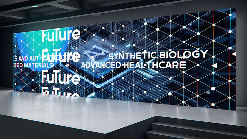
Modern tech display showcasing future synthetic biology and advanced healthcare concepts

How Viewing Distance Shapes the Design

Pixel pitch is the distance between the LED pixels on a wall, and it sets how close people can stand before the image breaks into dots. A finer pitch packs in more pixels, giving a sharper picture for close viewing, and the right choice depends on how far the audience actually sits from the wall.

We design content with that number in mind. A detailed type treatment that reads beautifully on a fine-pitch indoor wall can turn to mush on a coarse outdoor screen seen up close. Knowing the pitch before the design starts means we build compositions that stay legible at the distance people will actually view them.

It also shapes what belongs on screen at all. Fine detail, small type, and subtle gradients are design decisions that a coarse wall will simply refuse to render. Better to know that at concept stage than at rehearsal.

Building Content at Native Scale

LED content should be built at the exact pixel dimensions of the screen, not a standard video size stretched to fit. Vector-based and natively rendered assets stay crisp because they are made for the canvas rather than scaled into it.

Event walls are rarely a tidy sixteen by nine. They are wide, sometimes extremely wide, occasionally curved, and often split across panels with physical gaps between them. Designing at native scale means composing for that real shape from the first frame rather than cropping a standard video and hoping the important part survives.

Frame rate matters just as much. LED walls run smooth motion at high refresh rates, and content delivered at sixty frames per second avoids the flicker and judder that lower-quality clips show under bright stage lighting. These are not optional polish items. They are the difference between motion that feels expensive and motion that feels like a placeholder.

Brightness, Contrast, and the Room

A wall calibrated for a dark auditorium behaves differently in a bright foyer. Deep blacks that look rich in a controlled room turn flat and grey under daylight, and fine contrast steps disappear entirely.

The practical consequence is that colour decisions cannot be made on a monitor alone. Content destined for a bright space needs stronger contrast and simpler tonal separation than the same idea would need on stage. Designing without knowing the lighting condition is designing blind.

The point of all this groundwork is simple. The audience should never think about the technology. When the pitch, resolution, frame rate, and brightness are handled properly, people just experience the environment, which is exactly the goal.

Designing for Different Kinds of Spaces

The thinking shifts depending on whether you are filling a conference stage, a retail wall, or an immersive room, and good content respects those differences.

Conference and Stage Backdrop Content

For corporate events and conferences, the screen supports a human speaker. The motion has to frame the person, reinforce the message, and then get out of the way. Restraint wins here. The content carries the brand and the mood without pulling focus from the words being said on stage.

There is a practical constraint people forget. A presenter stands in front of the wall, so the centre of the composition is frequently blocked by a human being. Designing the important information into the areas a speaker does not occupy is basic, and it is skipped constantly.

Conferences also run on a schedule that slips. Content built in fixed-length blocks with no flexibility becomes a problem the moment a session overruns. Loopable segments and open-ended holding states are worth more than a perfectly timed sequence that cannot bend.

Nighttime bus stop with large digital screen displaying "Franklin Templeton" and "Future" branding

Retail and Permanent Branded Spaces

For branded environments and retail, the screen often has no presenter to support, so it has to hold attention on its own. Loops need to feel alive without becoming repetitive, and the motion has to reward both the person glancing for two seconds and the one watching for two minutes. This is closer to spatial storytelling than to a single ad.

Bold peach text on blue background spells out design, illustration, computer, godness

Repetition is the specific enemy here. A loop that delights on first viewing can become irritating to staff who see it four hundred times a week. Variation, whether through longer cycles, subtle randomisation, or content that shifts with the time of day, is what keeps a permanent installation liveable for the people who work beside it.

Immersive and Experiential Rooms

For immersive and experiential rooms, the screen can wrap the viewer entirely. Depth, perspective, and forced-perspective techniques let a flat surface suggest a space that extends far beyond the wall, which is the kind of effect that only works when the content is designed around the exact viewing position.

Across all three, the constant is intent. Every surface earns its place. Nothing is on screen because the screen happened to be there.

How an Event Motion Graphics Project Actually Runs

Environmental work has a different shape to a standard video project, and knowing that shape early prevents most of the friction.

The first difference is that the space exists before the content does, or at least its dimensions do. The earliest useful conversation is not about creative direction, it is about what the surfaces are, how big they are, where people stand, and what the lighting will be. Creative decisions made without those facts get unmade later.

The second difference is that environmental content is rarely one deliverable. A single event might need an opening sequence, holding states, lower thirds, transition stings, sponsor frames, and a closing sequence, all of which have to look like one family. The work is as much system design as animation.

The third difference is that the deadline is immovable. An event happens on its date. That inverts the usual production logic, because the schedule is fixed and the scope is what flexes. Building in time for a technical rehearsal on the actual wall is not optional, and it is the first thing cut when planning starts late.

What we need from a client at the start is straightforward. The screen specifications and physical dimensions. The run of show, or the intended behaviour if it is a permanent piece. Brand assets in editable form rather than flattened files. And a named decision-maker, because environmental projects touch marketing, events, IT, and sometimes facilities, and consensus by committee does not survive an immovable date.

The strongest results come when the motion design is part of the production conversation from the start, alongside the set, the lighting, and the schedule. Bringing content design in late forces compromises that the audience can feel, even if they cannot name them.

Where Event Screen Projects Go Wrong

Most failures in this space are predictable, and nearly all of them are decided long before anyone opens a design file.

Designing for a monitor instead of the room. Work approved on a laptop can fall apart at scale, in the real lighting, seen from the back row. Approval should happen against the actual conditions wherever it is possible.

Treating the wall as a television. Repurposing a finished sixteen by nine video for a wide, panelled, or curved surface produces the mismatched look that environmental design exists to solve.

Briefing spectacle without a reason. Impact for its own sake burns attention and leaves nothing behind. The strongest environments carry a single clear idea that the motion supports.

Ignoring the idle state. For anything permanent or ambient, the resting state is what people actually see most of the time. Designing only the highlight reel leaves the piece looking unfinished in its normal condition.

Splitting the work across vendors with no shared direction. When different suppliers handle different surfaces with no single visual authority, the seams show. Nobody can point to which decision was wrong, but the room feels incoherent.

Starting too late. Almost every compromise above traces back to this one. Environmental content brought in after the set, the stage, and the schedule are locked inherits every constraint and gets to influence none of them.

How the Craft Holds an Environment Together

The reason some environments feel premium and others feel cluttered comes down to craft consistency. When one team carries a project from concept through to final delivery, the visual language stays intact across every surface. When the work is split across vendors with no shared vision, the seams show.

This is the discipline we bring from a typography and motion design background. The same care that goes into a single stand-out motion graphic piece goes into making sure a whole room of screens speaks with one voice. Type, colour, timing, and pacing are decided once and applied everywhere, so the environment never contradicts itself.

Working end to end also means the technical constraints reach the designers rather than arriving as a surprise at delivery. When the people who know the wall specification sit alongside the people composing the frames, the compromises happen at concept stage where there is still room to solve them, instead of at rehearsal where there is not.

If you are weighing how this fits the wider picture of where screen-based work is heading, our look at motion graphics trends shaping visual storytelling in 2026 covers the ground beyond the event hall. If you are still deciding whether your environment calls for flat or dimensional work, our guide to choosing between 2D and 3D animation is a useful starting point, and our overview of motion graphics styles covers the visual languages available to you.

Conclusion

Motion graphics for LED displays do their best work when they stop being a video and start being a place. Treated as environmental design, screens shape how a room feels, guide attention, and give a brand a presence that people stand inside rather than simply watch. That is what makes an event or a space genuinely memorable.

The takeaways are straightforward. Know which mode you are commissioning, whether linear, responsive, or immersive, because it changes everything downstream. Design every surface as part of one coherent world. Respect the hardware, the pixel pitch, the native resolution, the frame rate, and the room’s lighting, so the craft survives contact with the space. Design the idle state, not just the highlight. And bring the content thinking in early, while it can still shape the space rather than merely fill it.

Get those things right and the technology disappears. What people remember is the feeling of the space, which is exactly the point of designing environments instead of filling screens.

Attention is the hardest thing to earn. CRITICA helps brands earn it through motion graphics, video, and experience design that people actually stop to watch. Singapore-based, working across Finance, Healthcare, Technology, Hospitality, Tourism, Oil & Gas, and Renewables. Get in touch and let’s figure out what makes sense for your business.

Black screen with no visible content or details

FAQ

What are event motion graphics?

Event motion graphics are animated visuals designed to play on the screens at an event. They cover opening sequences, stage backdrops, LED wall content, holding states between sessions, award reveals, and sponsor frames. Unlike a standalone video, they are designed as a set that has to hold together across every surface in the room.

What file format and resolution should LED wall content be delivered in?

Deliver at the exact pixel dimensions of the wall rather than a standard video size, as an MP4 using H.264 at a high bitrate, at sixty frames per second where the processor supports it. Always ask the AV supplier for the precise canvas size and a chance to send a test file before the live date, because panel configurations rarely match a standard aspect ratio.

What do you need from the AV supplier before designing event visuals?

The exact pixel canvas of each surface, the pixel pitch, the processor and its supported frame rates, the physical dimensions and any gaps between panels, the lighting condition in the room, and the playback method. Those six facts determine most of the design decisions that follow.

What are experiential motion graphics?

Experiential motion graphics are animated visuals designed for physical spaces rather than for a single screen. They cover event opening sequences, LED wall content, lobby and retail installations, interactive displays, and immersive environments. The defining difference is that the content is designed around the room, the surfaces, and how people move through the space.

Related Posts

Chat with AI

Hello! How can I help you today?